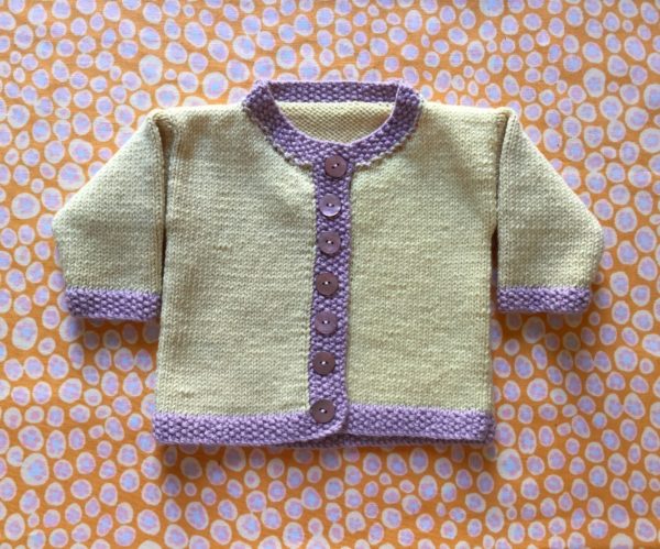
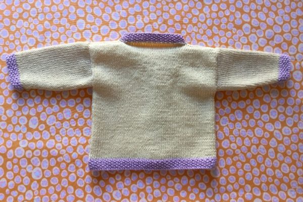
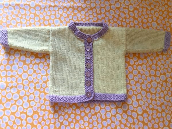
Yellow Chanel style jacket (Debbie Bliss pattern)
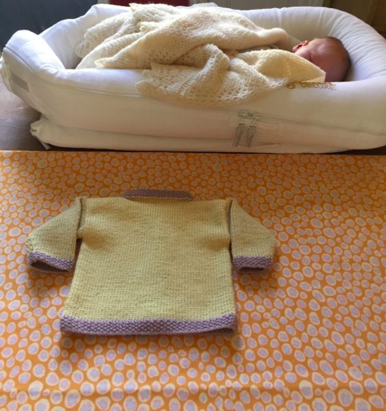
Second time round and I just whizzed through this pattern – well yes, there is a great deal of plain knitting and it is indeed a very small garment…(Debbie Bliss pattern and her baby cashmerino wool). In Chanel fashion the jacket seemed to call for a different coloured edging and I think the mauve works really well with the soft primrose yellow. I couldn’t resist photographing the finished article on my last piece of Designers Guild fabric from the 80s which has the same yellow and mauve in the little pebbles. (They made gorgeous curtains lined in an Ian Mankin striped ticking which hung in the guest bedroom in Ipsden Vicarage and which I had altered for one of the bedrooms here just before we heard we had to move out! Such is life. Not sure they’ll be needed in our next house, although I shall try to shoehorn them in.)
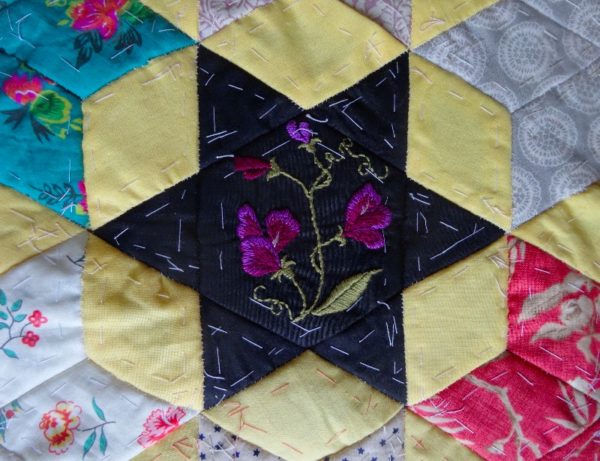
Me and my daughters love yellow (never thought to ask my son!) and no house feels quite right unless there is a yellow room or yellow furnishings (see photo below). Yet I get the feeling that few love to live with the colour as we do. And I say this because when Laura Ashley was in its glory years (the 70s through to the 80s) and a design was produced in several colours it was almost always the yellow that was the first to be discontinued. (Just as I had decided to go out and buy a few metres for cushion covers or to back a patchwork quilt. I had to settle for remnant pieces and it’s not that long ago that I used the last bit as appliqué on a cushion – the light yellow flower on the ‘F’ cushion; the deep golden fabric is an equally lovely Liberty lawn which, again, I only ever saw in the sale.)
Yellow is however a very contentious colour when I come to think about it. On the one hand the colour means great gorgeous bundles of life – the sun’s rays, fields of ripening corn, voluptuous egg yolks sinking into the translucence of olive oil to produce butter coloured mayonnaise and so many flowers from the sheeny iridescence of the buttercup to the sunflower, whose petals and seed head display a whole range of textured yellows. Gold leaf haloes and splinters of light in Renaissance paintings suggest holiness while the Emperors of China thought yellow was so special that only they were allowed to wear clothes in the colour. For Hindus the colour represents so much that is good and positive – peace, happiness, knowledge and learning – Vishnu, Krishna and Ganesha all wear yellow. All good so far.
But then in nature and especially in the animal kingdom, bright yellow more often than not is a warning sign, for pigments producing yellow can be deadly. Even in humans a yellow colouring to the skin is a sign all is not well within. In the early days after a baby is born we carefully monitor any initial yellowing, knowing that continued discolouration is cause for serious concern. Jaundice in young and old indicates problems with the liver where innocent sounding bilirubin a yellow pigment formed from the breakdown of red blood cells builds up instead of being excreted by the body.
In the plant kingdom, every year deciduous trees’ leaves change from green to yellow as chlorophyll breaks down and waste products are pumped into the soon to be rejected leaves.
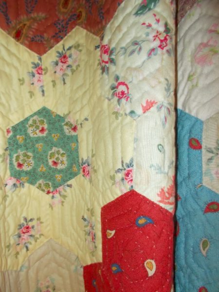
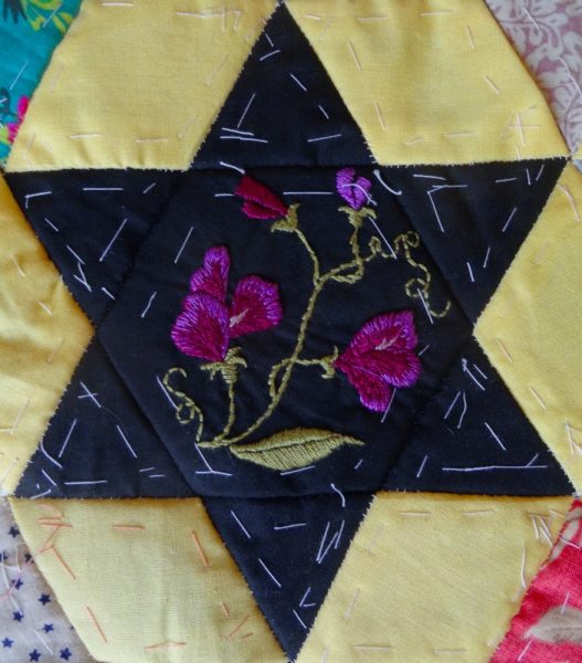
Patchwork curtain showing favourite yellow Laura Ashley fabric
Yellow pigments used in art and painting and decorating are no less lethal.
Gamboge and orpiment (literally gold pigment) are both poisonous, although interestingly Winsor & Newton only stopped selling it in 2005. Victoria Finlay in her wonderful book Colour ((Hodder & Stoughton, 2002) describes hunting out her piece of gamboge in a shop in Hong Kong and the delight she got from adding a drop of water to what looked like a piece of dirt encrusted chewed up toffee to create a glorious bright yellow paint. Some packages Winsor & Newton received from their suppliers in the 1980s which came from Cambodia and Vietnam were even more lethal for they contained unexploded bullets where the resin containing the pigment had dripped from the tree on to the ground. Victoria gave her piece of gamboge to a 9 year old boy she got talking to on a train and explained about the war and the risk someone had taken to collect it. For several reasons, she later wished she hadn’t!
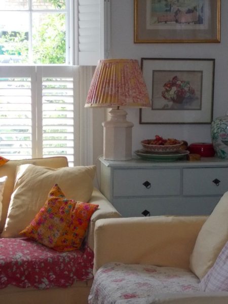
London sitting room with yellow sofas, cushions and lampshades
Indian yellow is another pigment with an elusive history. Said to be produced from the urine of cows fed exclusively on mango leaves, it has long disappeared as a commercial pigment. In the 1880s Sir Joseph Banks was curious about it and sent a request to know more to the India Office. Nine months later a report came from an Indian civil servant along with some of the pigment, an earthenware pot, some mango leaves and a sample of the urine. Urine, pot and leaves have all disappeared but the slightly smelly pigment has survived and to this day remains in Kew’s archive.
If you want to learn more about yellow pigments – acid yellow, chrome yellow and the various saffrons – do get copies of these two books. Victoria’s is the most wonderful travelogue in search of pigments of every hue, (one of my favourite books which I re-read from time to time and never want to be without) while Kassia St Clair’s book, more of a useful handbook to be dipped into, has coloured page edges so you can see at a glance the colour you want to read about.
Colour: Victoria Finlay (Hoddr & Stoughton, 2002)
The Secret Lives of Colour: Kassia St Clair (John Murray, 2016)
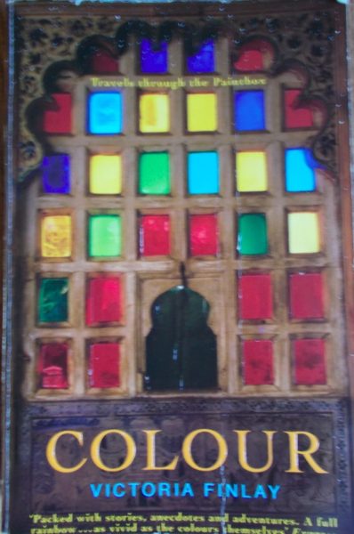
Colour: Victoria Finlay (Hodder and Stoughton, 2002)
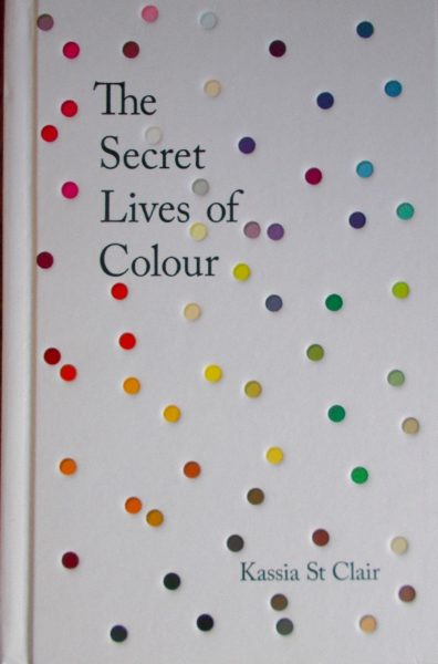
The Secret Lives of Colour: Kassia St Clair (John Murray, 2016)