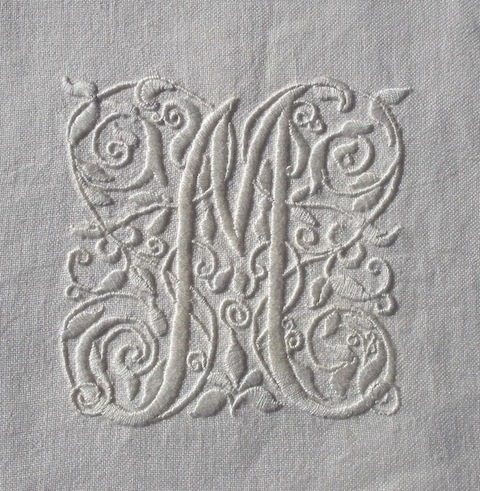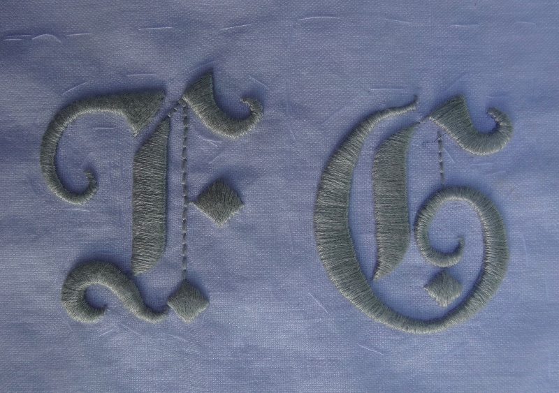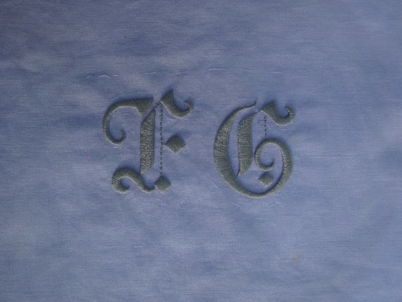
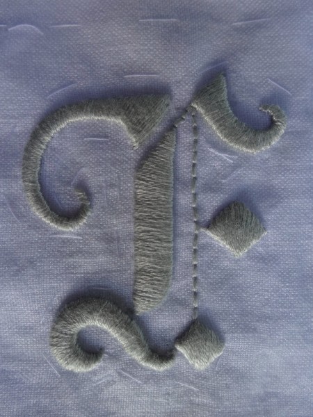
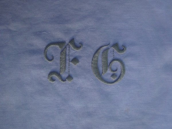
Gothic wedding monogram F G (hand embroidered by Mary Addison)
Anyone who reads this blog will know I like using different styles of lettering for my monograms. I haven’t used Gothic letters much – in fact just once before for a single letter ‘k’ and much as I love the style I think some Gothic letters are not very clear to C21st eyes. But then I came upon a few letters of a Gothic alphabet interpreted for cross stitch and thought the F and G perfect with just the right mixture of thick and thin and curvy and straight. Fortunately my list of recent weddings taken by the vicar included a couple with these very initials, so that was it… and off I went on a good solid pair of sturdy, no nonsense initials embroidered in a silvery grey.
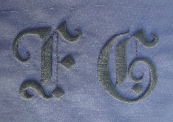
Wedding monogram: detail (hand embroidered by Mary Addison)
Today very little printed matter comes in Gothic or even New Times Roman – even our computers have drop down menus of more typefaces than we know what to do with. Some, however, stand out and often it’s the ones that appear in front of us every day that are particularly interesting.
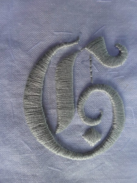
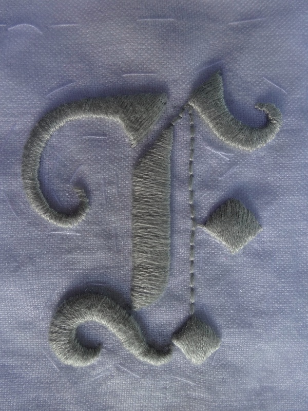
Wedding monogram: detail (hand embroidered by Mary Addison)
British motorway signage is a particular favourite of mine, so I was delighted to discover that of the Kinnear and Calvert duo that designed them, Calvert is a woman. Margaret Calvert also designed transport pictograms, like the man with his spade stuck in a pile of earth ( a workman or the common domestic male grappling with a garden parasol in an unusually heavy wind ?) Margaret is still alive and her Islington house is reported to be a treasure trove of traffic signs, stacked carelessly along the hallway, through into the living room and even up and on to her desk (see picture).
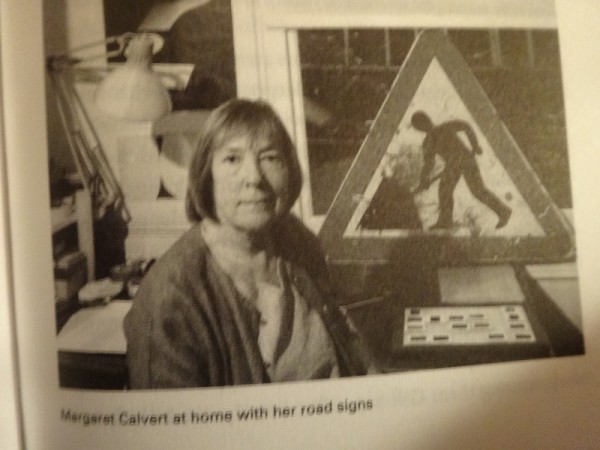
Margaret Calvert (from Simon garfield’s Just My Type ; Profile Books, 2010)
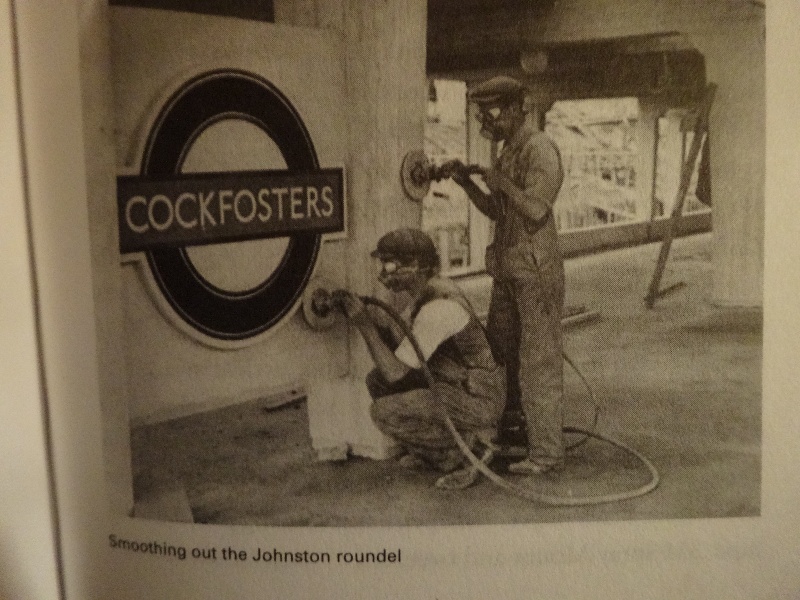
Transport, this time the London Underground, also gave rise to another much loved typeface. Imaginatively called ‘Underground’ it was the work of Edward Johnston, who was first a calligrapher and then a typographer, Underground was quite a trail blazer as this was the first typeface designed for everyday use by anybody and everybody. Curiously the blue plaque commemorating Johnston celebrates him as ‘Master calligrapher’ rather than as the man who signed the Tube and gave it a unique corporate identity. ( The familiar logo – the red ring with the blue line through it – was also Johnston’s work.) Johnston’s blue plaque is also unique in that all other blue plaques (even those of other typographers) use the same font while this one uses his own.

Edward Johnston’s underground sign and Underground font (from Simon garfield’s Just My Type ; Profile Books, 2010)
I used to live in Chiswick and we would regularly walk along the river to Hammersmith. Houses along the way had been and continue to be homes to more famous people than I can get excited about listing but what I now notice is that there were rather more typographers than you would expect in any random stretch of road. Hammersmith Terrace, a short range of tall, flat to the road houses whose back gardens were embanked high directly over the river has 3 blue plaques, 2 of which are to men of type. Emery Walker, at No 7, friend of William Morris and leading figure in the Arts and Crafts Movement is described as Typographer and Antiquary, while Edward Johnston mentioned above was at No 3. (In fact May Morris, William Morris’s daughter also had lived here but for some reason she doesn’t merit a plaque – well, there you go).
Simon Garfield’s Just My Type ; Profile Books, 2010)
Now Emery Walker was in partnership with Thomas Cobden-Sanderson (who lived a bit further along our walk at 15 Upper Mall , just beyond the Thames-side Kelmscott House at 15 Upper Mall) and together they set up the Doves Press in about 1900 with the aim of producing the most beautiful books. Their most famous book was the Doves Bible of 1902 using print commissioned from Edward Pierce (who had earlier also made type for William Morris) while the hand-drawn text of the first page was designed by Edward Johnston (already mentioned above). In 1908 the partnership split and a legal agreement was signed such that Cobden-Sanderson would own the type until his death and after that it would pass to Walker. But then Cobden-Sanderson did a peculiar thing. Privately, he decided that his beautiful type must never be used for inferior purposes and to this end he coldly and methodically set about destroying the whole lot, choosing to consign it to the murky waters of the Thames at Hammersmith Bridge, batch by batch, over a period of three years.
Gothic style F & G wedding monogram (hand embroidered by Mary Addison)
The disposal of the type was no easy matter. The matrices (the casts for the type itself) were loose but then he had to get rid of the metal letters themselves, many of which still formed the typeset pages of the last book printed. These he wrapped up with string and brown paper, and took them to the bridge one at a time – some nights he took 3 pages. A frail man of 76 at this time he must have made a strange sight on the half mile trek to and from the bridge. One night two packets dropped, caught on a ledge and for a time remained clearly visible. He knew he was behaving appallingly for he expressed fears of being caught in his diary. However, no one did stop him nor had any idea of what he had done until after his death, when his will and diary were read and revealed all. Walker, was not at all pleased and tried to get Pierce to remake the type but the craftsman was too old to repeat his work and the project languished. Walker later settled out of court with Thomas’s wife Annie Cobden-Sanderson (a well-known suffragette).

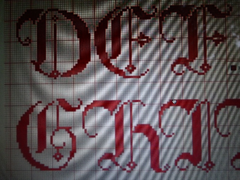
Gothic lettering: design for cross stitch; origin unknown
The C21 has produced a man of equal but more charitable obsession with the Dove type. Richard Green, at first on his own and then aided by the Port of London Authority’s Salvage diving team has found about 150 individual pieces of type beneath the bridge. See here for details of this along with a couple of short videos in which Robert Green talks about his obsession with the type and the story. Green has himself produced a digital version of the type – a labour of love which threatened at times to destroy his marriage. (If you can’t get the video to play try it on Youtube directly). Green has loaned his finds to the Emery Walker’s House in Hammersmith Terrace – a symbolic act of restoration to a man Green feels was treated badly.
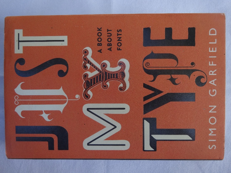
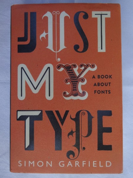
For a really riveting read about typefaces, do pick up a copy of Simon Garfield’s Just My Type (Profile Books, 2010). It’s truly unputdownable and no sign will ever look quite the same again.