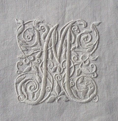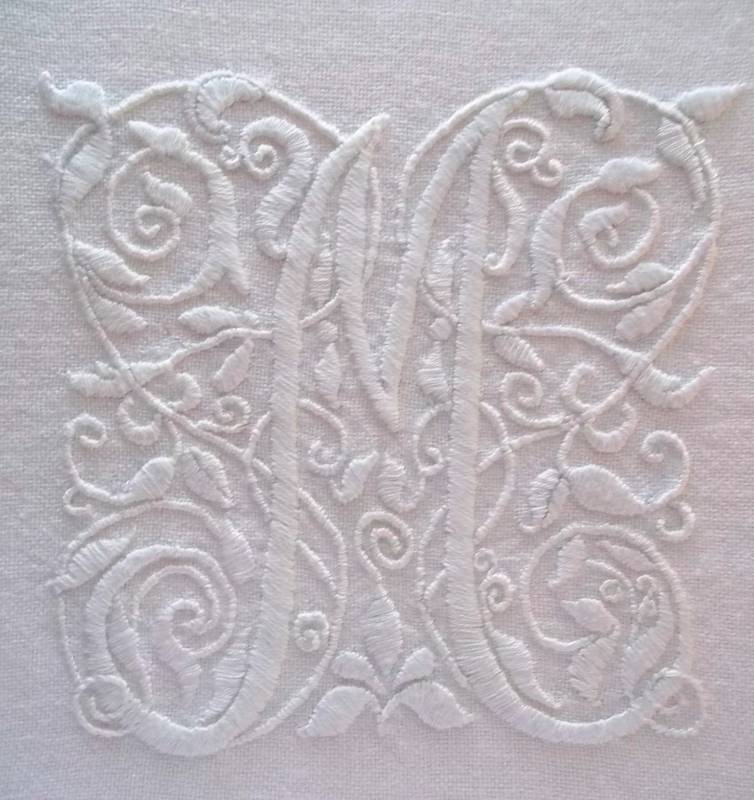
The fanciful letter: M. Hand embroidery in white embroidery thread on white linen by Mary Addison
Of course, this is the ‘M’ that appears at the top of my blog. As a few people have commented on it recently, I thought I’d talk a bit about the design. It was embroidered a couple of years ago when I was first playing around with the idea of embroidered monograms for anything other than shoe bags or science overalls. I was much taken with a design in Thérèse de Dillmont’s Encyclopedia of Needlework produced for the DMC Library (a book which stumps the library cataloguer in me as there is no obvious publisher and no date of publication) and so I copied the picture (see below), scaled it up as best I could and decided on adding an M for Mary. When it comes to embroidery I find it’s always better to let the needle take me, so there are twiddly bits where I didn’t think I could fit a leafy bit in and vice versa. Direct copying is always boring and actually very difficult to do.
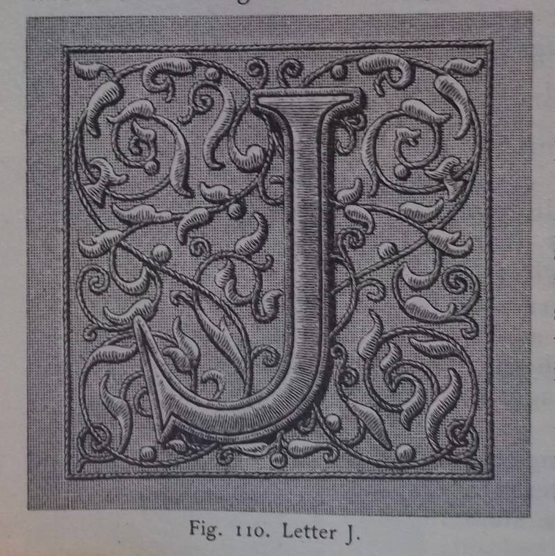
Letter J (p.58 of Encyclopedia of Needlework by Thérèse de Dillmont; early C20th)
There’s something very satisfying about this sort of design and to see if I could find out more about its derivation, I turned to one of my Dover books on decorative alphabets (there are many; I have three), imaginatively called ‘Decorative Alphabets and Initials’ (ed. Alexander Nesbitt, 1987) and there I found a set of decorated initials very similar to that of the J above.
The caption beneath describes the alphabet as “arabesques …popular after 1550 – used by Jean Crispin at Geneva”. In the text such decorated letters are referred to as ‘fanciful initials’ and placed firmly in a tradition going back to manuscript origins of early handwritten books.
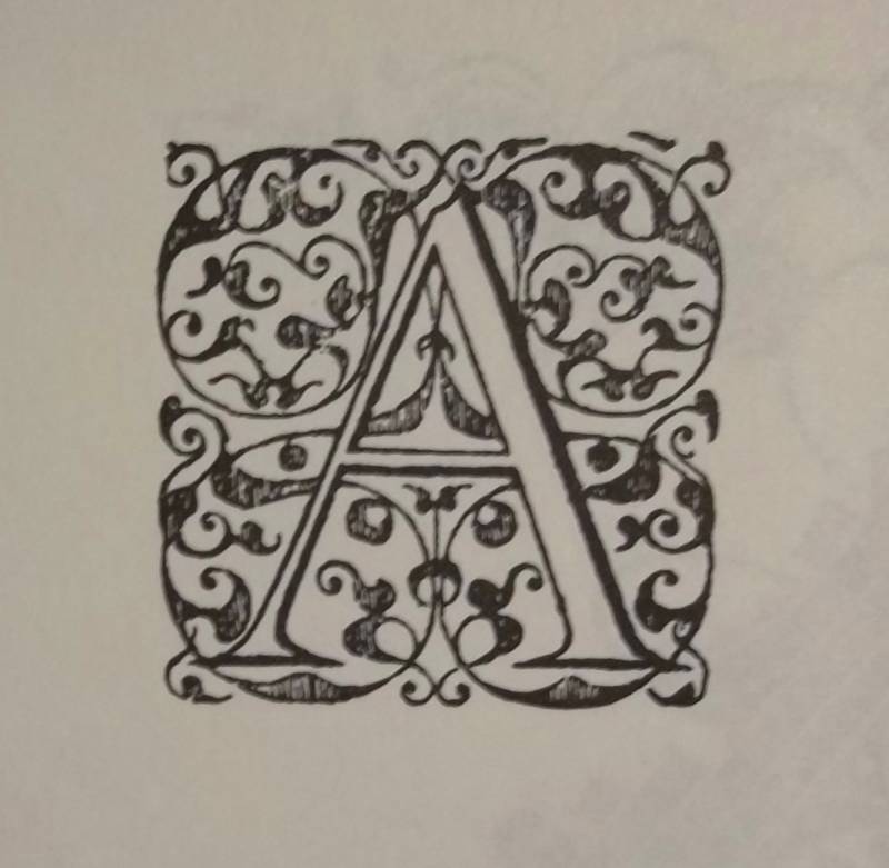
letter A from an alphabet probably by Jean Crespin at Geneva, post 1550 (from Decorative Alphabets and Initials: ed. Alexander Nesbitt, Dover 1987)
Such an origin is obvious when you come to think of it but what I hadn’t realised was that when printing was in its early days spaces were left in the printed text so that scribes could continue to embellish the text with the finest hand painted individual letters. This no doubt helped to sell the books at a good price as the ornamentation was not only lovely to look at in itself but it may also have been thought to draw the eye away from the mass produced main body of the book. Who knows? Perhaps the illuminators were members of a powerful guild which successfully campaigned for their continued employment.
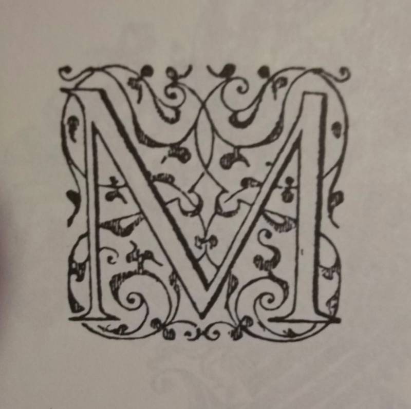
Letter M from an arabesque alphabet by Jean de Crespin of Geneva, post 1550 (from Decorative Alphabets and Initials; ed. Alexander Nesbitt, Dover, 1987)
In fact, this final flowering of the scribes’ art in the new industry of mechanised book production flourished for a surprisingly long time over several generations. Eventually, however, the printers were finding that the gaps left for hand decoration went unfilled because, as my Dover book says, “the practice of rubrication languished”. An end was called on this long goodbye and the printers turned to wood engravers for their initials and illustrations so that the whole could be set as one unit and printed accordingly. The printers must have breathed a joint sigh of relief to have greater control over their product.
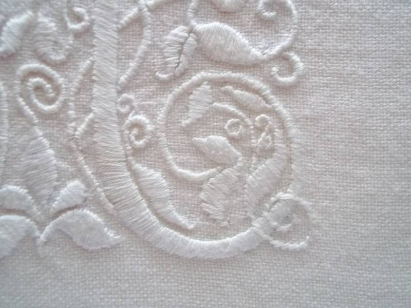
Whitework M: detail of hand embroidery in white embroidery cotton on white linen (Mary Addison)
The advent of movable type, using pieces of metal type cast from matrices struck by a letter puncher, advanced printing technology further and printing reached a high point under the Germans in the early C15th with the production of the Gutenberg Bible in 1455. French influence then became dominant, although so great was the interchange of style and motif that it is impossible for the non academic to discern national differences in a growing European industry. Jean Crespin’s alphabet shown above has a strong Italian Renaissance flavour and the fact that it is referred to as an arabesque alphabet suggests Islamic influence underpinning the design.
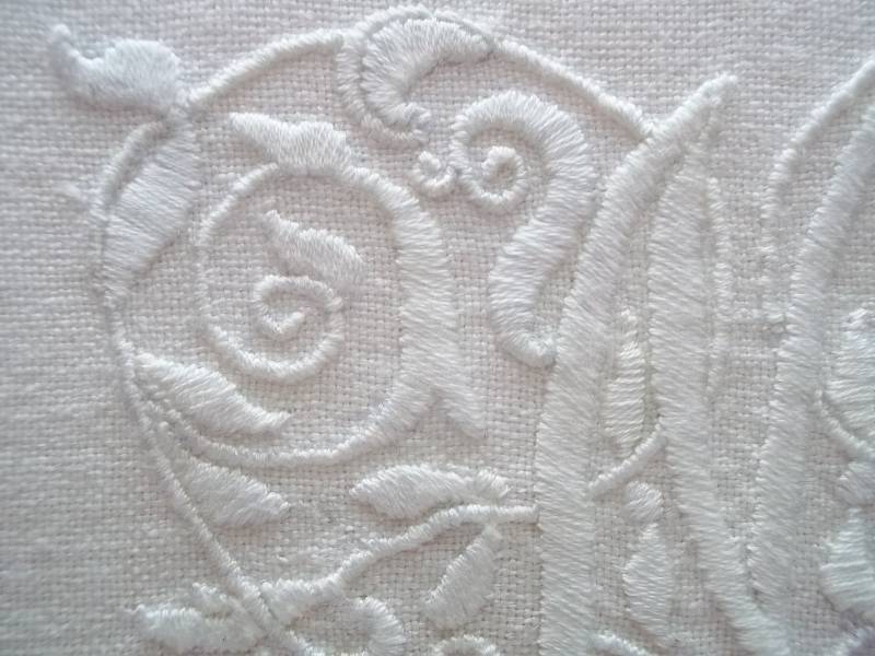
Whitework M: detail of hand embroidery in white embroidery cotton on white linen (Mary Addison)
It is worth a brief diversion here into the origin of the word cliché, which was ‘coined’ by the printing industry. Clichés were bought-in initials cast from matrices or moulds. Until this time printers had their own little foundries or used inherited type. Recycling of initials was widespread and apparently worn down initials rejected by the elite presses of Paris or Lyons could often be seen with their slightly outmoded charm decorating the work of provincial printers. A cliché (literally a stereotype) is said to be so-named in imitation of the sound made by dropping the matrix on to molten metal. Strangely the SOD (Shorter Oxford Dictionary) dates this original use of the word cliché to as late as 1832, when my Dover book suggests its employment a full 3 centuries previously. By contrast the use of cliché as a stereotyped expression the SOD says was commonplace by 1892. (Stereotype is, of course, also a printing expression and the SOD is equally adamant about a C19th origin for the word.)
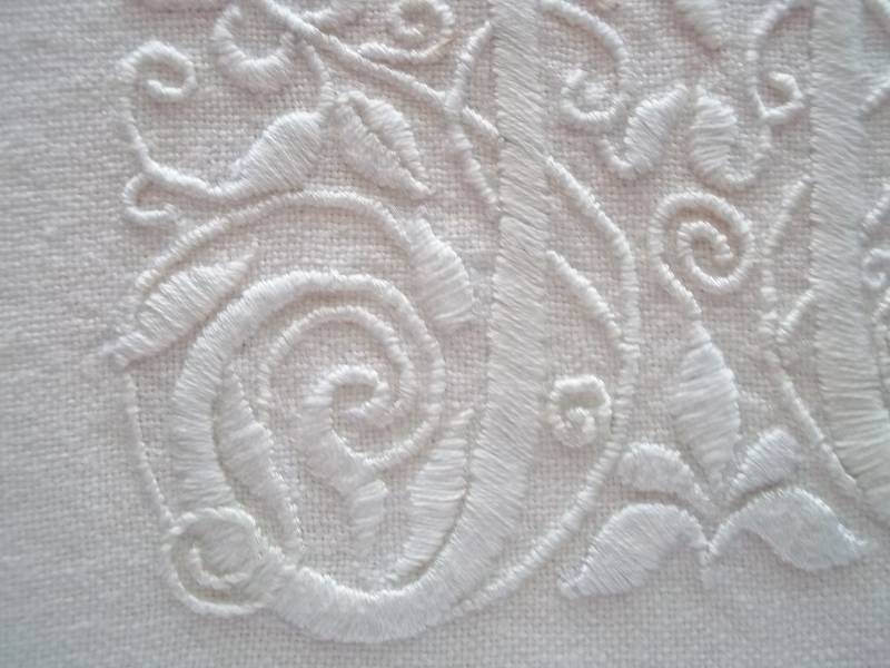
Whitework M: detail of hand embroidery in white embroidery cotton on white linen (Mary Addison)
Balliol College library where I work has a fine collection of manuscripts and early printed books. In general there is little time for us to do anything other than give a cursory glance over the books in our special collections (although many have been photographed and are available online) but when we get a book out for an exhibition or for a reader we get a tantalising glimpse of some wonderful decorated initials. Here is what we think is a single page from Caxton’s Canterbury Tales of 1477. Although the initials on this page are not especially decorative nor fanciful, I think it is interesting to see a piece of early English printing. When I have more time to chase photos of manuscripts I remember a fleeting glimpse of I will add a direct link to them. Should anyone wish to peruse Early Manuscripts held by Oxford colleges they should look here.