
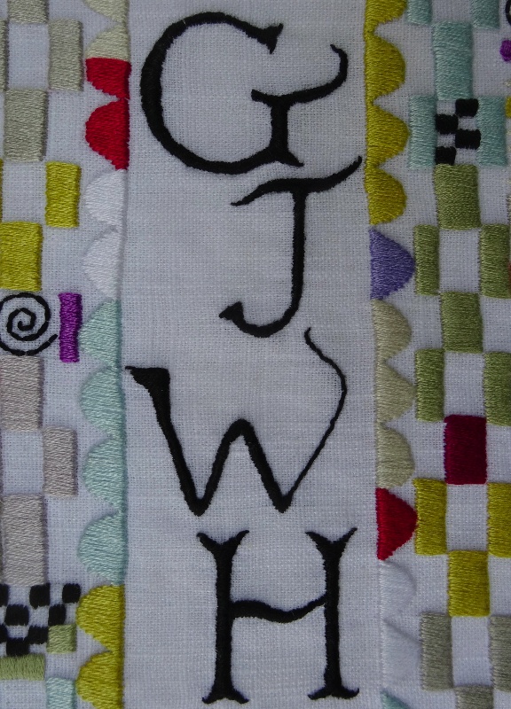
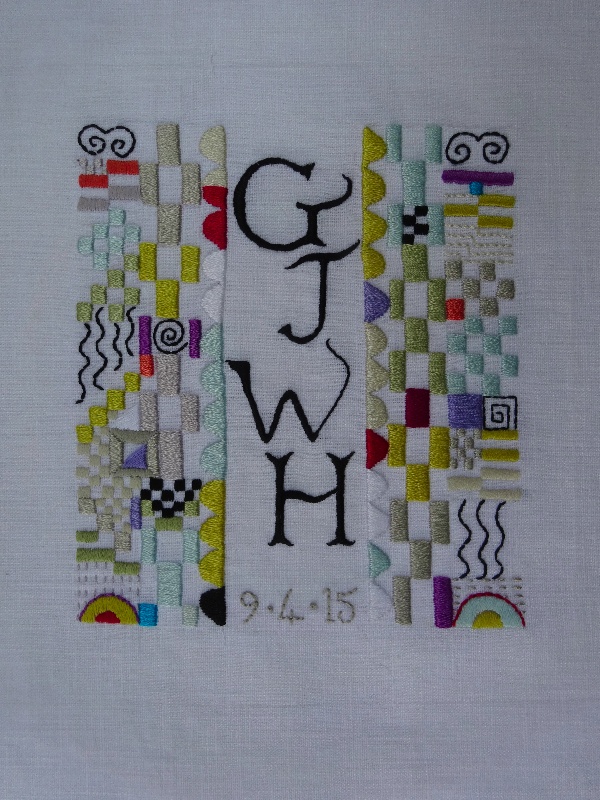
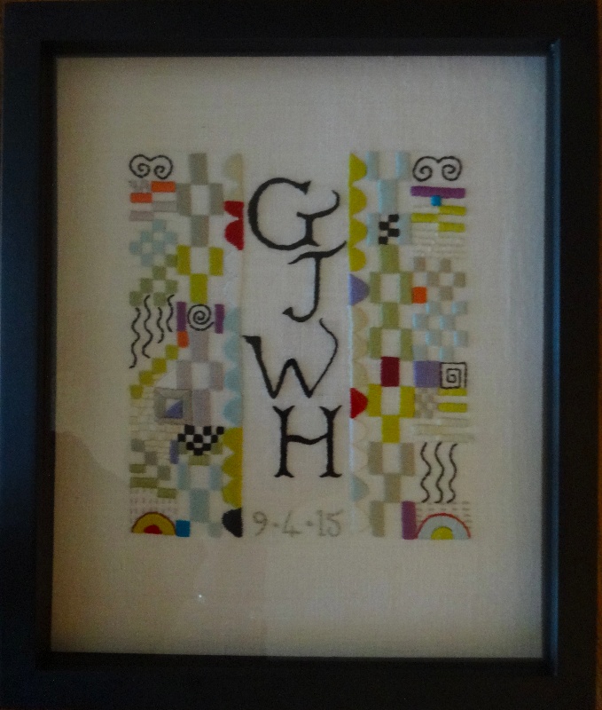
Building block monogram: a baptismal present for a baby boy (hand embroidered by Mary Addison)
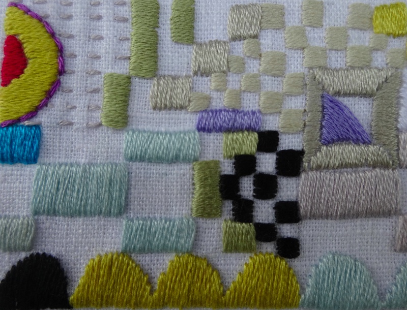
When I’m planning a baptismal embroidery for a baby boy I always chew on my pencil much more than designing for anyone else. It would be nice to make something which they still find fascinating aged 5, 10 or 15 – a lot to ask. So no bunnies, lambs, dinosaurs or tractors; in fact let’s forget anything figurative and head straight for the abstract. The fact that what initially inspired me were textiles (Josef Frank) and jewellery (Josef Hoffmann) is neither here nor there and if you don’t tell, I won’t. Anyway the finished piece reminds me much more of my grandson’s building blocks with a few slightly architectural squiggles thrown in, so I’ll settle for that.
Building block monogram: a baptismal present for a baby boy (hand embroidered by Mary Addison)
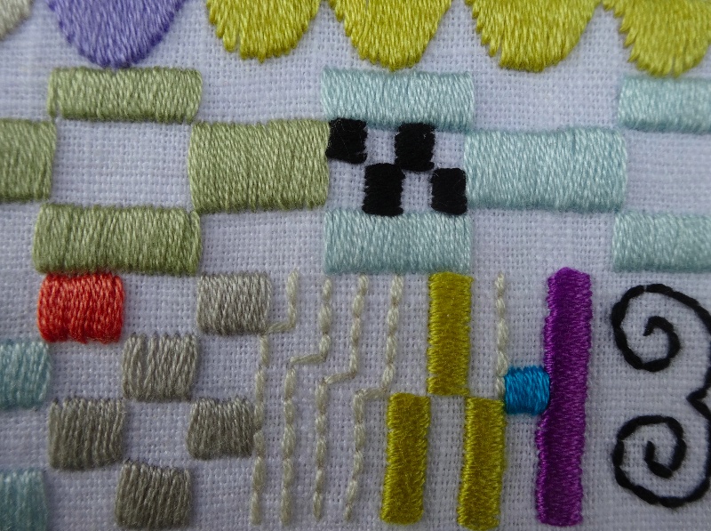
Embroideries like this are great fun to do as you can just make up the shapes as you go along. Choosing colours is interesting too as less is definitely more. I’m always tempted to use lots of bright colours but have learnt that half-colours like grey, khaki, stone – and dare I say it beige – provide the best setting in which just a few bright colours have a greater impact. Perhaps I have used too much red in my embroidery. I am, however, quite proud that I restrained myself with turquoise which I used only twice.
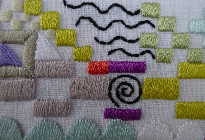
Building block monogram: a baptismal present for a baby boy: detail (hand embroidered by Mary Addison)
The subtle use of the smallest blob of red pigment has a great history. Constable understood its judicious use as a means of directing the viewer’s eye. In the Hay Wain of 1821 for example, he gave the horses in the middle of the picture a red harness to attract our attention (though they were more likely to have been brown leather). In other of his paintings there are often several small patches of the colour – a man’s jacket, a woman’s skirt, a red scarf which help direct our gaze and mind to move around and explore the painting.
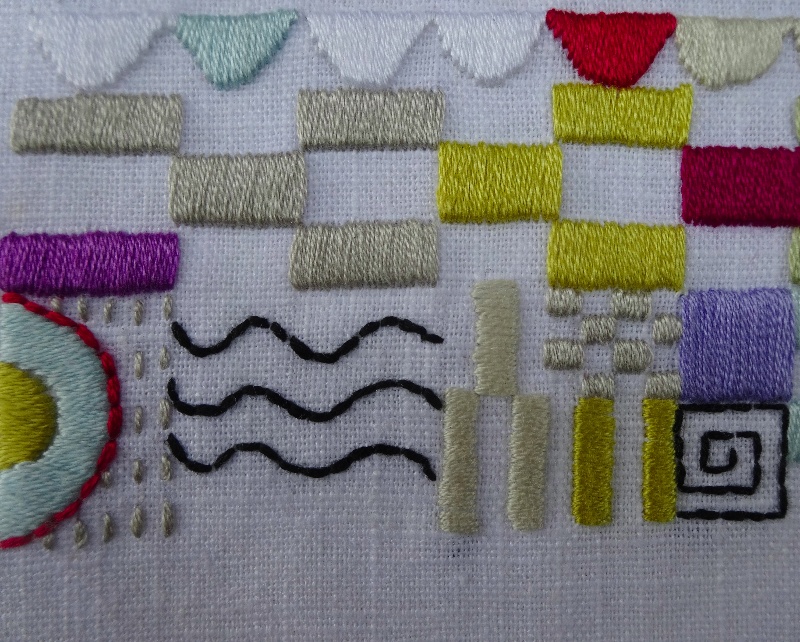
Building block monogram: a baptismal present for a baby boy: detail (hand embroidered by Mary Addison)
But in 1832, Constable was himself to be trumped by a blob of red paint – even worse, a last minute blob of red applied by his arch rival J.M.W. Turner. One year older than Constable, Turner was made a full fellow of the Royal Academy while still a young man of 27 in 1802; Constable had to wait until another 27 years for the same accolade. There was much bitterness in this for Constable.
Building block monogram: a baptismal present for a baby boy: detail (hand embroidered by Mary Addison)
Varnishing day at the Royal Academy and Constable revealed one of his six footer canvases. He had worked on ‘The Opening of Waterloo Bridge’ for about 10 years and he was confident that it would be well received and reinforce his reputation. Varnishing day for Turner was usually spent extensively painting or repainting his canvases but this time his rather low-key seascape (Helvoetsluys, Dutch ships in a gale) appeared finished … and somewhat pedestrian. Turner must have found it rather anaemic too for he fetched his paints and low down in the middle of the raging sea applied that infamous blob of red paint. (Closer inspection reveals it to be a red buoy).
Building block monogram: a baptismal present for a baby boy: detail (hand embroidered by Mary Addison)
The viewer is now sucked into the picture via the red buoy and the composition has become vibrant and energised. I don’t see this myself but as Constable took it very badly – “He (Turner) has been here and fired a gun” – who am I to spoil a good story. (And the excellent high point to a not quite so excellent Mike Leigh film -‘Mr Turner’ which was very beautiful in a somewhat ambling, unfocused way, I thought.) So, perhaps the moral of the tale is never underestimate the timely use of emphasis or a well placed manicule – but also don’t overuse them either.
Building block monogram: a baptismal present for a baby boy (hand embroidered by Mary Addison)
Building block monogram: a baptismal present for a baby boy (hand embroidered by Mary Addison)