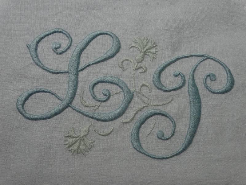
L & P wedding monogram (hand embroidered by Mary Addison)
It’s really time I came clean. I start out innocently enough using a word loosely but managing to communicate. I then end up using this word a lot and the more I use the word, the more irritated I become with my imprecision. Just as whenever anyone writes about the Bayeux Tapestry the first thing they feel bound to point out is that it’s not actually a tapestry (it is an embroidery but I’m sure anyone reading this knows that), so sometimes when I use the word ‘monogram’, a little smart alec voice in my head says, “but it’s not actually a monogram”. So, just to be clear, the embroidered initials shown in this post do not constitute a monogram. A monogram involves two or more initials interacting or interweaving with each other to form a single symbol or motif which is an independent design identity, complete in itself. Now, some of the wedding initials I have embroidered do this but the ones in this post do not. It is, however, convenient for me to gather them all under the umbrella term ‘monogram’ and when I get round to having some sort of index for the blog all initials will appear there.
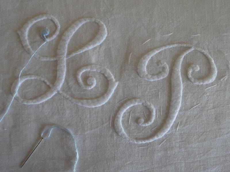
Felt letters as a base for embroidery
Now to the L and P. Having decided on the style of these initials, I thought I’d to try to make the letters look a bit more 3-D. In the past I’ve padded out the letters with lots of lines of running stitches or used satin stitch slanting one way and then sloping the other way, but this involves a lot of sewing without really getting enough of the desired effect. This time I thought I would try drawing the letters out in reverse on Bondaweb (is this the same thing as what Americans call freezer paper?). I then ironed this on to white felt and cut out the letters. After peeling the thin layer off the back of the letters, I next ironed the felt letters on to linen and these were then slip stitched to the linen to make sure they didn’t move (see photo above) There was a bit of trimming of the thin lines to make them finer but that wasn’t difficult to do. Embroidery was then much easier and the effect was exactly what I wanted. If I had been braver I would have had the cornflowers overlap the initials but I thought for now enough is enough, so the cornflowers just twiddle around in the middle as if caught by a gust of wind with a talent for casual flower arrangement.
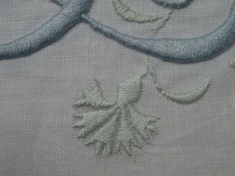
L & P wedding monogram: detail showing cornflower
I don’t like using hoops as I don’t enjoy stab stitch – up/down, up/down. I much prefer taking my needle down and up in the one smooth move i.e. actually taking a stitch and I find I produce smoother stitches this way. Backing my linen with ‘Stitch ‘n Tear’ helps mitigate against the problems of tight stitching. (You pull or cut away this stabilising fabric when the embroidery is finished.) This suits the way I like to work, although many frown upon this method. The world is however big enough for both big enders and little enders and it may be good to know that if you don’t get on with hoops, there is an alternative. (I was happy to toe the line and work with a frame with the cathedral embroiderers.)
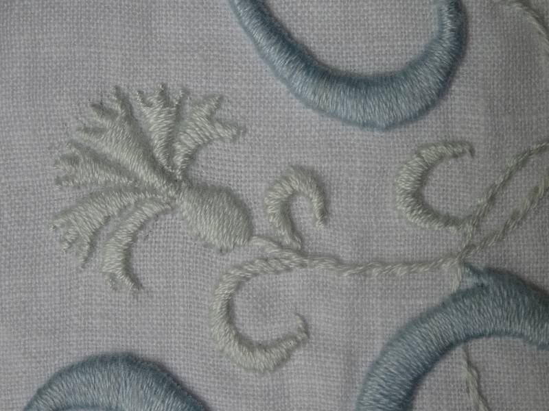
L & P wedding monogram: detail showing cornflower
I enjoyed working with this lovely pale blue and it made me remember the last blue wedding initials I did almost a year ago and the post I wrote on Penelope Fitzgerald’s ‘The Blue Flower’.
Below is an elegant border of cornflowers from an Ashmolean book about Lucien Pissarro and his work for the Eragny Press. It would make a lovely embroidered border for the neck of a dress or something similar and I though I’d include it to make up for my own woeful cornflower of a few posts ago. (Thank you Cornflower for mentioning my poor sprig).
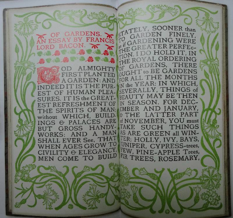
Cornflower border (from: Lucien Pissarro in England: The Eragny Press 1895-1914; pub: Oxford)
I’m now off to London to visit my grandson who has 4 teeth but, not satisfied with those, is still after a couple more. I may need to correct spellings and punctuation when I return. Hope I at least make sense with the above.