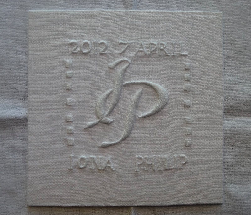
Wedding monogram IP (hand embroidered by Mary Addison)
This autumn I have filled up the first half of the week pretty solidly. On Monday, I go west with a friend for 2 hours of Italian in a village hall. Tuesday sends me in the opposite direction to the other side of Oxfordshire for a physiotherapy class for a dodgy knee in Henley (just 2 more classes to go now). On Wednesday I go north to Oxford to join the cathedral embroiderers at Christ Church Cathedral in Oxford where we have our heads down from 10 am – 4 pm. So now I find I’m shoehorning embroidery into a couple of half days, and hopefully a couple of full days later in the week and my productivity has dramatically decreased.
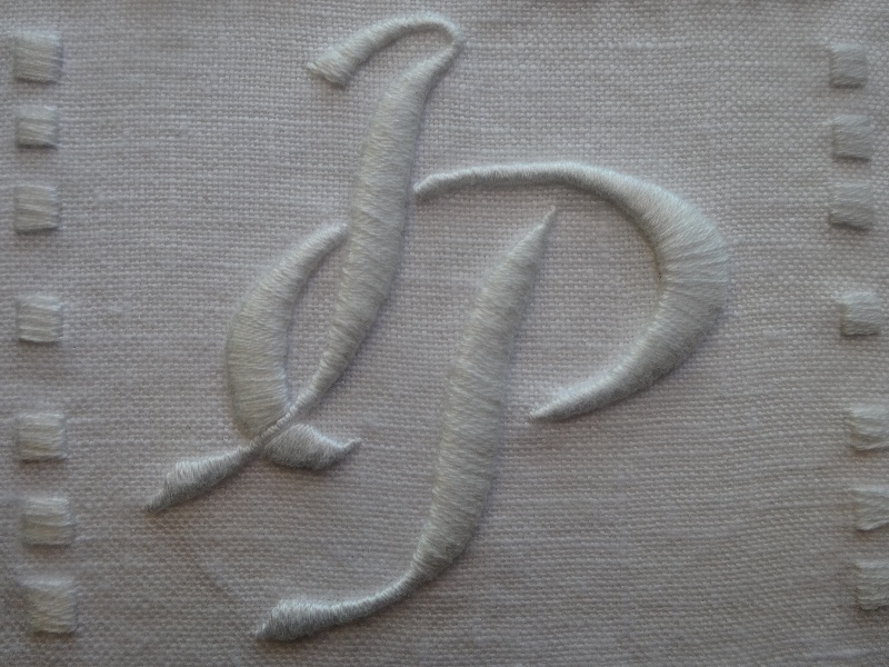
Wedding monogram IP: detail (hand embroidered by Mary Addison)
So, this week I just have a small monogram for a wedding long past – April 2012. It has, however, been a fruitful union as their second child is expected in December.
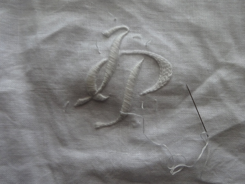
Wedding monogram IP: detail of chain stitch padding (hand embroidered by Mary Addison)
‘I’ is a difficult initial to make beautiful, especially if you don’t want it to look like a ‘J’. In spite of ‘i’ being the fifth most frequently used letter in English and the capitalised version putting in an appearance in about 1250, a capital ‘I’ does not become in regular use until about 1700 and at this time the capital ‘J’ and capital ‘I’ are almost indistinguishable (side by side the differences are clearer as the latter tends to be a less florid and less ornate version of the former; apart, you have to rely on context.) As you will see, my ‘I’ looks like a reduced ‘J’, so I included the name below to make matters clearer.

Framed wedding monogram IP (hand embroidered by Mary Addison)
The thread is Anchor No 1 (white) and the fabric is pure linen. I embroidered this without either hoop or stabilising the fabric with ‘Stitch & Tear’. I only realised half way through that I’d swept on with the embroidering without either of these aids but as there was no puckering I just carried on. Once again I mounted this on card with Stitchery Tape and used a small white box frame from Debenhams (£7, though there are often offers of 20% off when I tend to buy half a dozen).
6 Comments
It’s a great success – well done, especially on the “no puckering”…
Thanks Rachel. Very glad you like it.
Do you launder these before you frame them?
I once stayed in a chateau in France where the owner was an enthusiastic embroiderer of whitework monograms and there were some spectacular examples on display. I will see if I can find any photos for you.
It varies. Sometimes I draw out the design in pencil, go over this with running stitch and then wash it.
Sometimes if it looks grubby I will wash it and then perhaps spruce it up with another layer of satin stitch. In general I prefer to do the former but if I have to wash it before framing I console myself with the thought that I’ve seen many Victorian monograms that have been washed repeatedly and quite roughly and still look wonderful. Although I want them to look as good as possible, I’m after individuality rather than perfection.
How lovely to have a chateau for the display of your embroidery! I would love to see any photos should you be able to find them – it’s always stimulating to see other people’s handiwork. Thank you for thinking of me.
This is so beautiful Mary. I agree with your comments about the capital ‘I’. When my boys were younger and I was keen to imprint their names on the world, and decorate their rooms with small, named, keepsakes I found to my sorrow that Isaac’s capital just looked like a stick! Jacob came off a little better, at least the J has that satisfying loop at the bottom! x
How difficult – having both an I and a J. I do hope when they’re older their bank statements – or worse, love letters – don’t get mixed up! There are some things we don’t have even a glimmer of thought about when we name our children – I have a daughter AEJS and a son AJES. Fortunately they no longer live in the same house!